
Saturday, May 1, 2010

Friday, April 30, 2010
Carlo Scarpa - further precedent study
 1) Tomba Brion-Vega.
I love the multi-layered thickness of the walls, the bold, perpendicular juxtaposition of horizontal and vertical lines, and the long narrow corridor which rewards the viewer with the framed view at the end.
 2) Detail from Olivetti Showroom, Piazza S. Marco, Venice.
I love this interlocking squares, as well as the metallic qualities of the material. For me, this image evokes both a humble understanding of the material's natural properties, and a feeling of luxury and splendor.
 3) Interior of the Olivetti Showroom.
Where to start? The polished timber on the ceiling, the alternating floating stair widths, the warm glow enhanced by softly reflective surfaces, and the bench made of two concrete slabs.
I would really like to emulate the lighting effect by using sepia wash or yellow tones, this also references the colour of the painting.


Further exploration...
 The part on the right was my original drawing....the left is Anu's add on. :)
Tuesday, April 27, 2010
Draft Model

I made a quick sketch up model to express my ideas. The 3D visualisation will help me resolve final design details. The above image is the only visible elevation, this view would be embedded within the cliff face.

 Above: section cut looking from the cliff outward, showing the level changes, stairs and wall thicknesses.
Below: I wanted to explore the theme of interlocking lines not just by the overall form but in the interior and junctions detail.s The thickness of the steps here leading from the main room to the corridor are embedded within the thickness of the wall, each layer a different width to also expand on the idea of playing with proportion and perspective. I like the "frame" that is created for the entrance. Walking on the stairs is like literally through the frame itself, as if the frame is a space of its own, and not just a structure in between spaces.

 Above: the corridor. I wanted to play with the proportions of solids and voids. Structures are typically mostly voids, and a small percentage of solids, usually just for structure and not often as a design feature. What happens when this is reversed? Especially for a small scale structure. The narrow sliver near the ceiling allows a very small amount of light to be let in. The placement references the high windows in Vermeer's paintings.
Below: view of corridor from end room. The top step is the corridor itself, again creating a "frame".


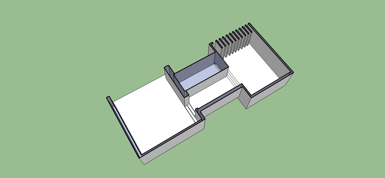 Two axonometric drawings give better indication of space and layout.
Further development of design...

I want the structure to consist of one open, exposed space for her to play music, perhaps in the presence of company, and another more private, secluded space.

Subscribe to:
Posts (Atom)